
Consequently, David Ortiz's autograph is one of the most faked Red Sox autographs on the market today because forgers know they can make a quick buck on his autograph without being too suspicious. It isn't Mike Trout or Kris Bryant, so an uncertified autograph of Ortiz's isn't going to have the kind of skepticism thrown at the owner as a Bryant or Trout autograph owner would.
Lucky for you, I have been collecting Ortiz cards for almost ten years now, and I can spot a fake from a mile away.
Here are some of my certified autographs of David Ortiz to use as a guide (not all of these are mine). I will walk through every millimeter of his autograph from every era so that you won't buy yourself a fake at a show or on an auction site.
1997-2000 Twins Era:
This is a certified autograph of David Ortiz from when he played with the Twins. This was likely signed pre-1997 or around 1997. Obviously, this signature is inscribed with a "27" which was his number on the Twins. This dates it to a certain time period already since Ortiz played with the Twins from 1997-2002.

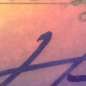
In the picture below, I have taken a piece of his autograph to analyze. In all David Ortiz autographs predating 1997 and signed close to 1997, these two dots before a "J" looking slash mark should always be visible. A longer dot followed by a shorter dot is what you should look for! Also, notice how the loops in his autograph look slightly boxy. This, along with the dots, changed over time. The first loop will almost always tower over the second loop and this is something that also drastically changed as he signed.
The "J" slash is actually the "S" from "Arias". The "S" should start close to the second loop after the two dots and will sometimes intersect the loop and dots. The "S" should start close to the loop and end/fade out to the left. This can be seen clearly in the picture. The "S" almost always fades out/streaks instead of an abrupt stop. Streaks in the loops are very common in Ortiz's autograph too, and if they can't be seen at all, then be cautious! Like all autographs, if it doesn't look like it was signed quickly, you should be concerned.

This scribble in older David Ortiz autographs is the "A" from "Arias" and as he signed autographs this faded out of the autograph. Generally, the sloppier the "A" from "Arias" the older the autograph is.

The picture below is a Fleer certified autograph of Ortiz from 2000. The same qualities can be seen in this autograph as the one above. The dots are more like lines on the right side of the autograph, but you can see that the longer line is followed by the shorter line.

2000-2006:
During these years, Ortiz kept up the same style in the majority of his autographs, however the two dots/lines that he had in his older signatures from the late 90's started to turn into just one solid line leading into the "S". Two examples can be seen below.
This 2004 Ortiz Donruss Certified autograph is seen with just one line leading into the "S". The "A" from "Arias" can also be seen sharpening and flattening out. (The line leading into the last loop is much flatter) Also, take notice that the loops in the autograph are becoming less boxy and more rounded.

This 2005 Topps Finest autograph is a good example of how he was starting to transition some of his autographs to just having one line/dot to the left of the "S" at the end of the autograph. (Since this autograph is from 2005 and features the two dots, but the previous picture is of a card signed in 2004 but features the one line going into the "S") This particular card happens to feature one of the autographs that has the two dots, but it also shows the flatter "A" in "Arias" and the rounder loops. The "S" at the end of the autograph will also begin to look more square, but will still end/streak out to the left.

2006-2012:
The autographs signed during these six years are going to feature the one line leading into the "S" of "Arias" (the closer to 2010-2011 the autograph was signed is when the line connects into the "S") and the loops will get continually rounder and less sharp. Identifying fakes that have the one line and a flatter "A" will generally lack the roundness of the loops. The loops need to be free-flowing with no stops and starts or slow moving pen.
Another feature that will start to fade from the autograph is the loop that kind of looks like an upside down and sideways cancer ribbon. In 2012, you see this feature mostly disappear. Below is an example of the loop I'm making reference to. This loop is still missing in his autographs as of 2016.

Here is an autograph I have of Ortiz from 2008 Topps Stadium Club. The loops are now both the same size, will commonly intersect each other, and they are so round on this particular autograph that Ortiz ran the autograph off the sticker. The one line into the "S" is visible (separated from "S"), and there is almost no "A" in "Arias" visible. Some will have an "A" visible, but from my observation, most do not. It seems like the "A" started to really reappear in the autographs that I see signed during the 2014 regular season.

This next autograph is from 2009 Topps Triple Threads. You can now see that the once two dots are now one solid free flowing line leading into the "S" at the end of the autograph. There is an "A" visible in this autograph after the first loop which is not as common to see the closer you get to 2006.

This autograph from 2011 Topps Marquee baseball features the round loops and connecting line into the "S" of "Arias". Another flat "A" going into the second loop is visible.

2013:
The autographs signed during 2013 are all about the same until we get to the postseason, and Ortiz for some reason changed up his autograph style a little bit. Maybe they were being signed faster, but they have a much different look to them. I know these as the "2013 World Series autographs" as they are very easy to spot.
The next two autographs are from 2013 Topps Museum Collection. No ribbon looking loop is visible at the start of the autographs. These two autographs were signed before the new style developed although the second Museum Collection card has hints of the new style coming.


This next autograph is from 2013 Topps Triple Threads. You can find this style (or something similar) on every World Series ball Ortiz signed that fall. There is a solid break in the line that fed into the "S" in autographs we saw from 2006-2012. This autograph just looks so much more symmetrical, straight, and flat to me. This is the autograph I call the "2013 World Series autograph". If you don't believe me that this is the style signed in the later part of the 2013 season, check it out for yourself!

2014-2016:
The 2013 style seems to have been a World Series exclusive style, because the autographs get sloppier as we move into this era. There are SOME good autographs in 2015 and 2016 and I have cherry-picked some nice ones off of eBay, but a lot of them are looking sloppy and weird. 2014 was a neat autograph year for Ortiz, though.
These next two autographs are from 2014 Topps Museum Collection. All of them have a visible "A" after the first loop, and they all feature connected lines moving into the "S".


Here is an autograph from 2015 Tier One. Ortiz started running that last loop into the "used to be dots" and then into the "S" from "Arias". It is almost as if he was getting lazy with the pen and decided to start running all of the autograph together to avoid picking up the pen when signing.

Here is a closer look:

Another example of this random running together of the autograph from a 2015 Topps Dynasty card.

Here is my 2015 Topps High Tek Ortiz autograph card. It doesn't feature the above sloppiness because this is one of the cards I cherry-picked off of eBay. It features a swirled "S" that is almost beginning to look like a "Z".

For comparisons sake, look at how inconsistent these are getting. I'm losing my feel for the patterns in style at this point. The "A" in "Arias" has returned again in some of these cards signed in the same set. I'm confused...

And lastly, this is an autograph from Ortiz in 2016. Needless to say, they are trending towards the sloppier side of his autographs. There aren't many examples I can use for the 2016 autographs yet as he just hasn't signed all that many yet.

But here are a couple of things to look for in any Ortiz autograph era that will generally hint at signs that point to a real autograph.
The tail on the first line of the autograph:
The tail on the ends of the loops (check out previous pictures for these tails!)

If inscribed, this is the style of his "34" inscription. Normal "3" and a "4" that looks relatively like a lowercase "u" with a really long tail or the number "7".

The line to "S" in "Arias" is almost always opened upwards like a bowl resting on a table.

So that is the evolution of David Ortiz's autograph. Hopefully it will save some of you some money at shows and on auction sites like eBay. There are a lot of fakes out there so be careful when collecting autographs. Here's to a killer season Ortiz! Cheers! To end this post, I'll ask you guys a question...
Are these like any of the David Ortiz autographs I described?
Currently on eBay for the nice ripe price of $99.99.


The answer is "absolutely not".
No comments:
Post a Comment